Don’t listen to anyone who tries to tell you which health care system is best. If you’re going to prove one country’s health care system is better than another, or if you’re going to figure out whether any changes in health care will make a system “the best”, you need an objective metric you can use to compare the quality of any given system, and that metric doesn’t exist.
The most direct way to measure the effectiveness of health care in a country is to take the amount of money a country spends on health care per person and divide it by the life expectancy in that country. The amount spent per person is probably the most straightforward way to represent the resources allocated to a system. Obviously, the healthiest life is a long life, so average life expectancy is probably the best way to summarize the health of a population.
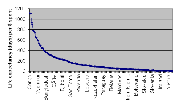
Conveniently, the United Nations Development Programme publishes the statistics for health care spending and life expectancy for each country. The most recent data available is from 2004 and 2005 for 176 different countries. I ran the numbers to create a “Length Of Life – Cost Against Total” chart (aka LOLCAT).

The United Stated rates dead last, way over at the right side of the chart, worse than Austria or anyone else. We get less than 5 days of life for each dollar spent on health care.
All this demonstrates is that the most direct, brutally simple, metric is a joke (thus the acronym). The United States certainly don’t have the worst health care system in the world. LOLCAT fails because the range in spending is so wide, it overwhelms the comparatively small differences in life expectancy. Life expectancy ranges from 82.3 years (Japan) to 40.5 (Zambia) (the US is 30th at 77.9 years) while health care spending per person runs from $6096 (the US) to $15 (the Congo). Generally countries that spend less have a lower life expectancy, but LOLCAT fails to relate that to poor health care.
Is it possible to create a valid ranking system if you consider more factors? The World Health Organization created a rating system that they used to rate 190 countries using data from 1997. They published the results in 2000. In that list, the US ranked 37th. The result may have some value if you fully understand the process that went into creating it, but the WHO itself didn’t think the results were worth the effort, so they have not repeated the rankings since 2000.
There are organizations like The Commonwealth Fund that gather the sort of of health care data you’d need to create a rating system. The Commonwealth Fund currently posts 195 “Quality and Efficiency” charts. They make no attempt to summarize the data into a single rating. Instead, they present the data so you can make your own decisions.
So how do you measure the quality of a health care system? You need to decide what factors to consider and what weight to give them. That’s a complicated job, and the decisions that go into creating a rating are subjective, not objective. Here’s just one example of a topic that could generate endless discussion: should abortions be covered by any government funded health care plan? Whatever you may believe, there are plenty of people to argue at great length for the opposing point of view.
In short, there’s no such thing as one best health care system. Keep that in mind when you think about health care reform. Whatever plan we come up with is going to be complicated, full of compromises, and loaded with possible unintended consequences. The only thing for sure is that anyone who says there’s a simple answer is either a simple (stupid) person or someone who’s trying to fool you.


What Soviet Medicine Teaches Us
http://mises.org/story/3650
Pingback: CGI BIZ Guides