(This is the 2nd post in a series that started here)
In my first post, we saw that most of the runners in the 2014 Boston Marathon ran positive splits. The data indicated that for a “typical” runner, every extra minute in the first half meant an extra 1:23 in the second half of the race. I took a pass at explaining the 23 second difference, but came up short.
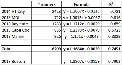
The next step is take a look at other marathons to see how their results compared to Boston’s. I pulled split data from five smaller races, selected mostly because the data was readily available online:
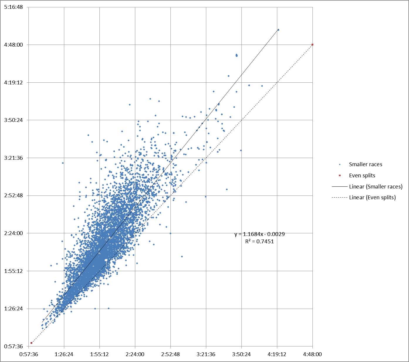
This chart illustrates the combined results from all 5 races:
As it happens, I’ve run four of the five races in the past few years (all but Maine). Baystate is notoriously flat. The others have their challenges which, like Boston, are for the most part concentrated in the second half of each course.
In all five races, the slope of the regression line is still greater than 1 (even splits). But in every case, the slope is closer to 1 than Boston.
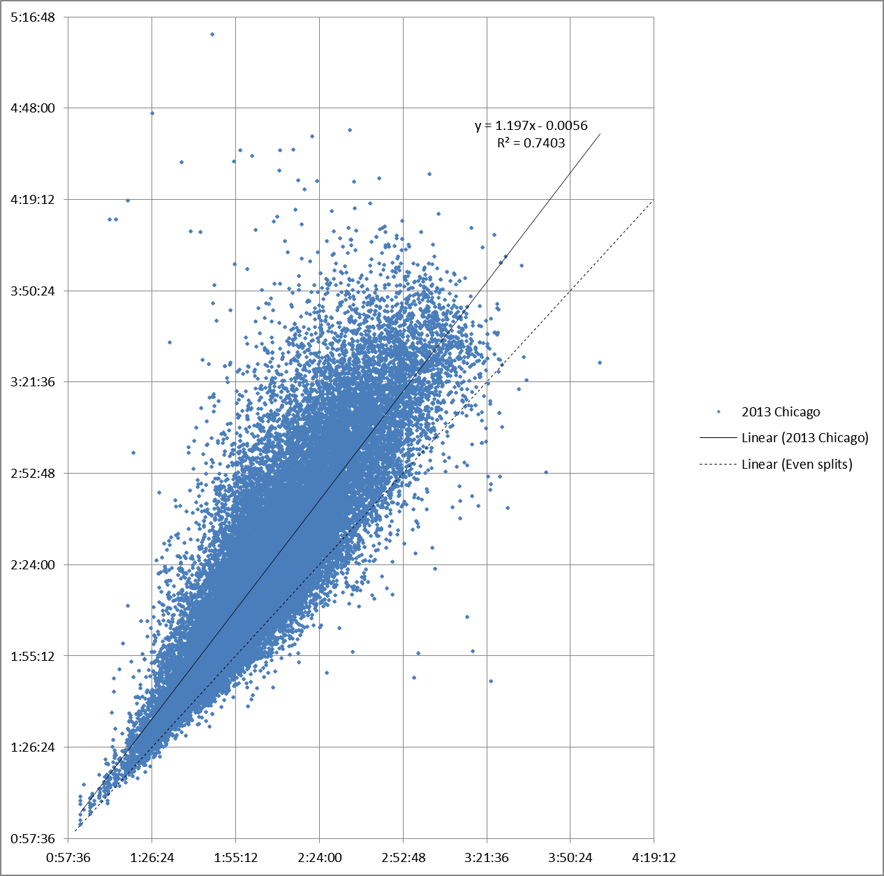
Those races are all smaller than Boston. Chicago, on the other hand, is about 30% larger, even after Boston expanded the field for 2014. Chicago is another very flat course.
The slope of Chicago’s regression line is still less than Boston’s. It remains greater than the slope of the even split line.
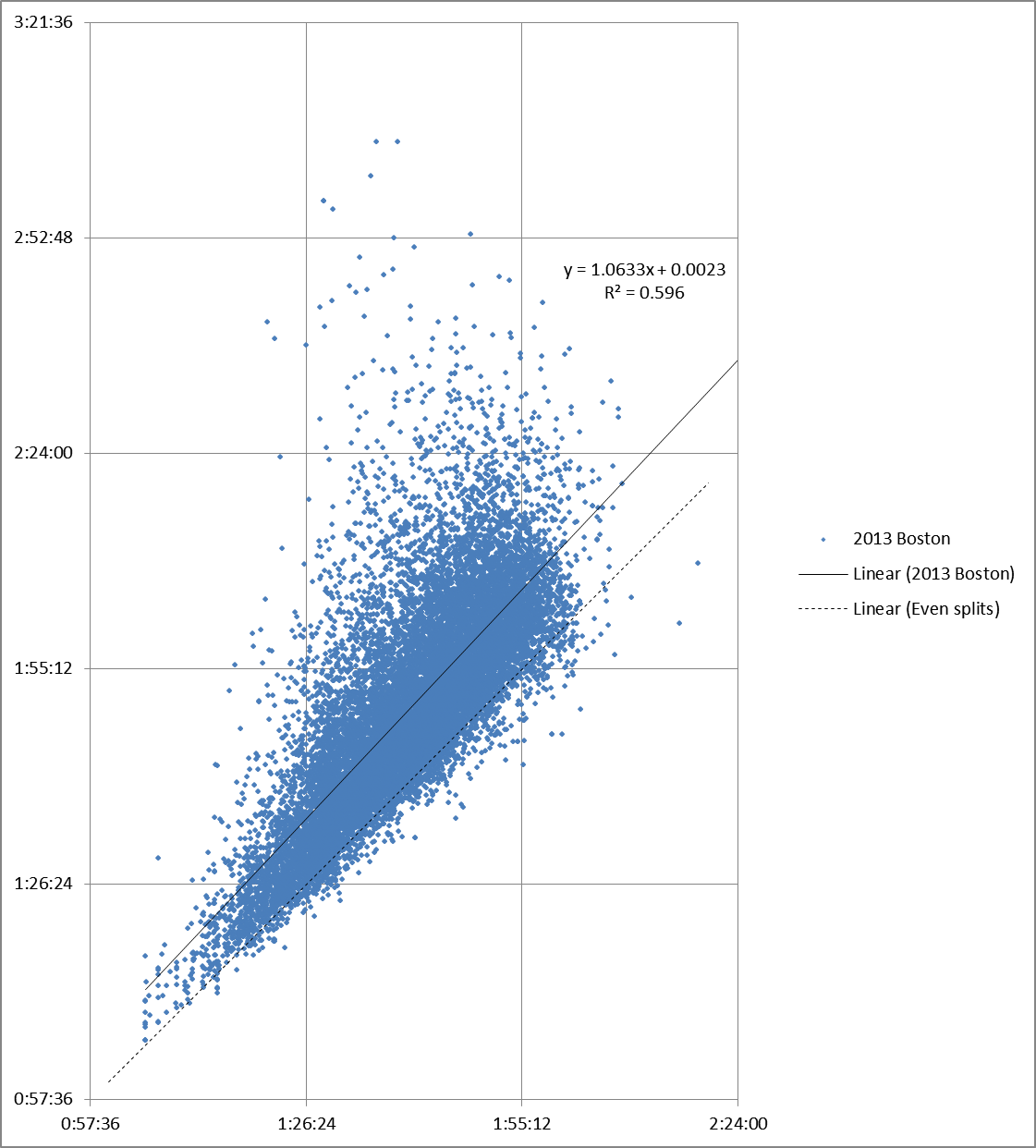
Ideally, the next step would be to compare the Boston 2014 data with data from earlier Boston Marathons. Unfortunately, the BAA web site only has split data for one other year, 2013. Since the race was cut short by the bombing, the data is incomplete:
The slope of the 2013 regression line is much closer to 1. Is that because the slowest runners were removed from the data set?
Maybe, maybe not. The R2 score for 2013 is only .596. Linear regression does a poor job of representing data like this when you cut off large chunks of the sample.
We’ll look into this more in my next post.


Pingback: Marathon splits at Boston 2014 | Y42K?
Pingback: Sun and Too Much Fun? | Y42K?
Pingback: Leituras de 5a Feira | Blog Recorrido