(This is the 4th post in a series that started here)
In this post, we’ll see how marathon split data is affected by age. But first, what might seem to be a digression:
Accuracy is sometimes overrated.
No one can keep 30,000 sets of marathon splits in their head, so we use charts and formulas to help simplify and summarize big sets of data.
The scattergram plots we’ve been making help us visualize how our data is distributed, but a graph with 30,000 points is still too complicated. So we reduce the complexity even more, by asking Excel to create a formula to describe the data.
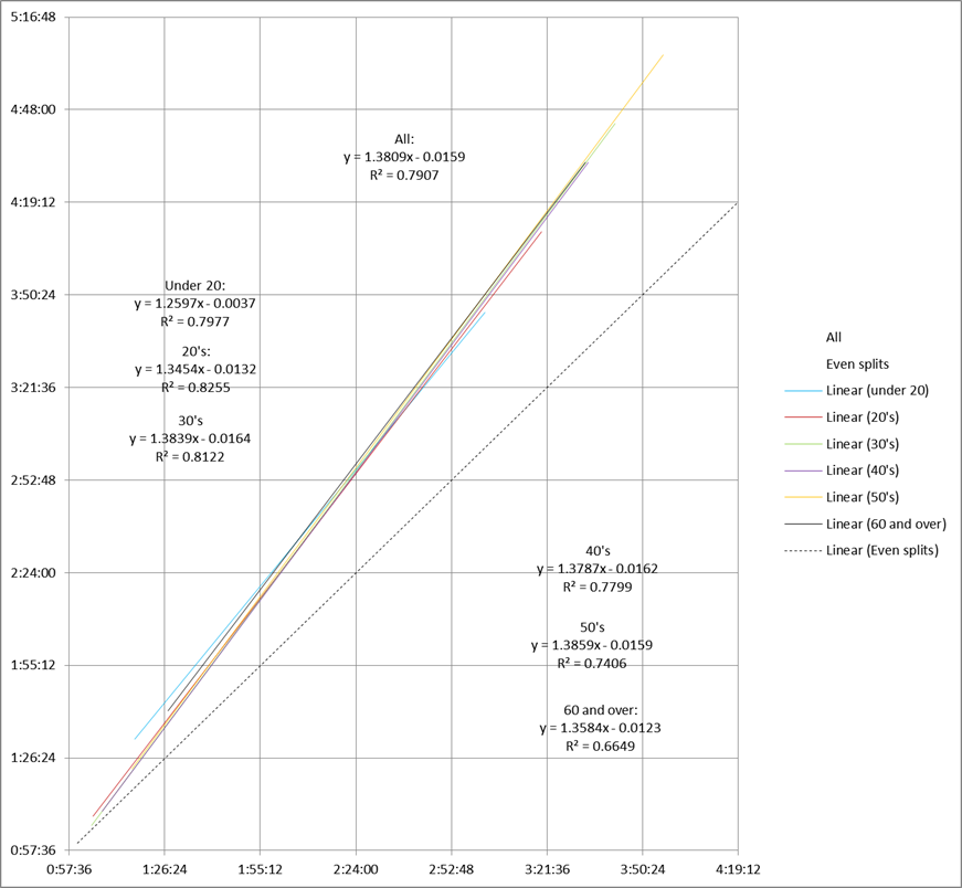
As an example, let’s look at the trendlines for our Boston 2014 runners, sorted by age:
As we’ve seen, linear regression creates a trendline that’s a pretty good fit for our split data. And a straight line is the easiest kind of formula to understand.
However, Excel has other options available. Some of them fit our split data even better than linear regression.
The best fit from the options provided by Excel is the “power” trendline. Instead of fitting the data to a straight line, Excel fits the data to a curve with a formula of:
y=axb
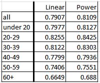
The R2 values for each line show that the power trendlines do a better job of representing the data:
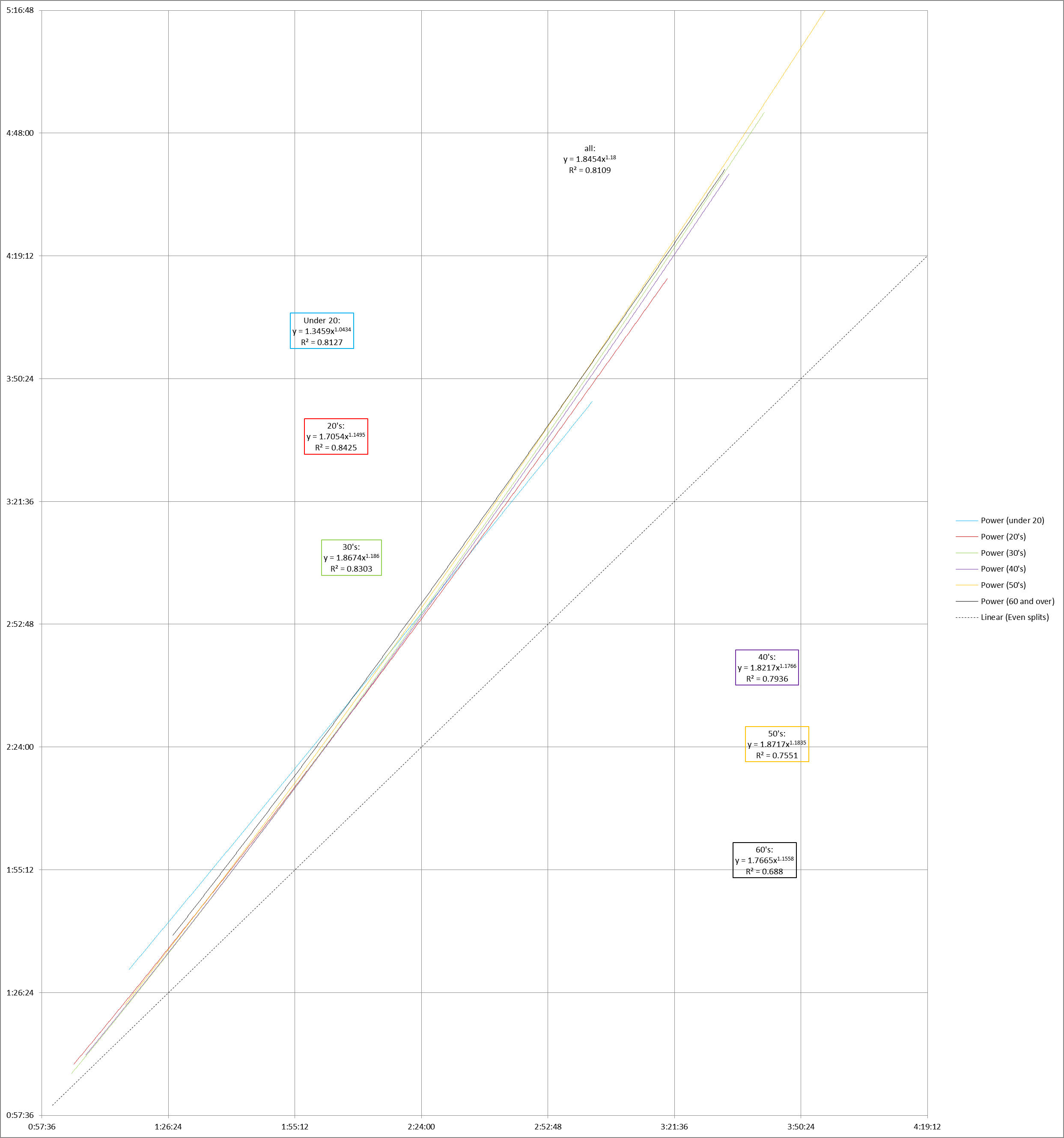
But the formula isn’t quite as easy to visualize as a straight line. Comparing two different power trendlines is much harder. I know that for values of b close to 1, the line is pretty close to a straight line, but I can’t guess how y = 1.8454x1.18 compares to y = 1.8674x1.186 without drawing the two graphs.
Here are the age trendlines again, this time generated with the power option:
Since the data for an entire race is fairly linear, the differences aren’t dramatic. Unless you blow the chart up to an enormous size (click on the image to see), it’s hard to tell the difference between the power curves and the straight lines.
Since the straight line is so easy to understand, it’s often not worth the extra effort to calculate a nominally more accurate type of regression.
Anyhow, going back to the straight line chart, when we sort runners into 10-year groups by age, we can see that there isn’t a whole lot of difference between the groups. To the extent that age matters at all, it appears that the young folks’ splits trend less positive than the rest of the field.
Next time, we’ll take a quick look at another data set.


