(This is the 6th post in a series that started here)
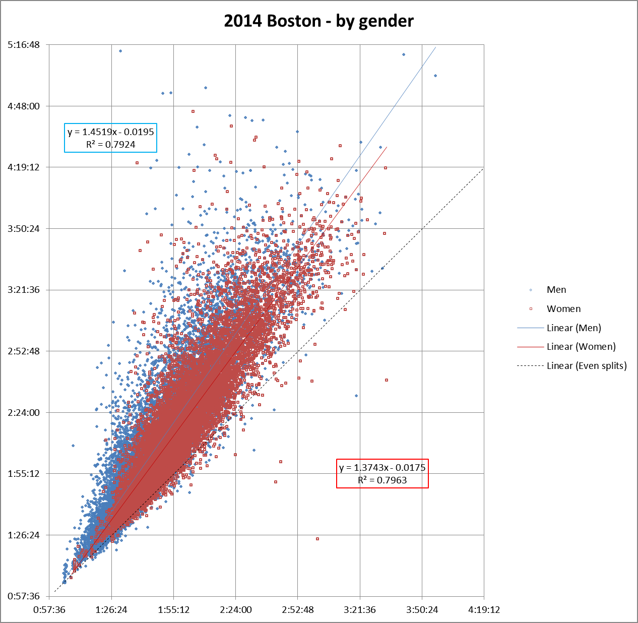
When we sort the Boston 2014 split data by gender, this is the result:
Yes, I colored the boys’ data blue. Sue me.
The graph shows that, as finish times go up, (as runners get slower), second half split times for men increase faster relative to first half splits than they do for women.
As we know, the average man runs faster than the average woman (Sorry, ladies!). For example, at Boston 2014, the average man ran about 3:52, while the average women ran a 4:13. So our data illustrates that while slower runners do tend to have more positive splits, the fact that splits for one group of runners trend towards the positive more than another group’s splits does not necessarily mean that that the first group is slower.
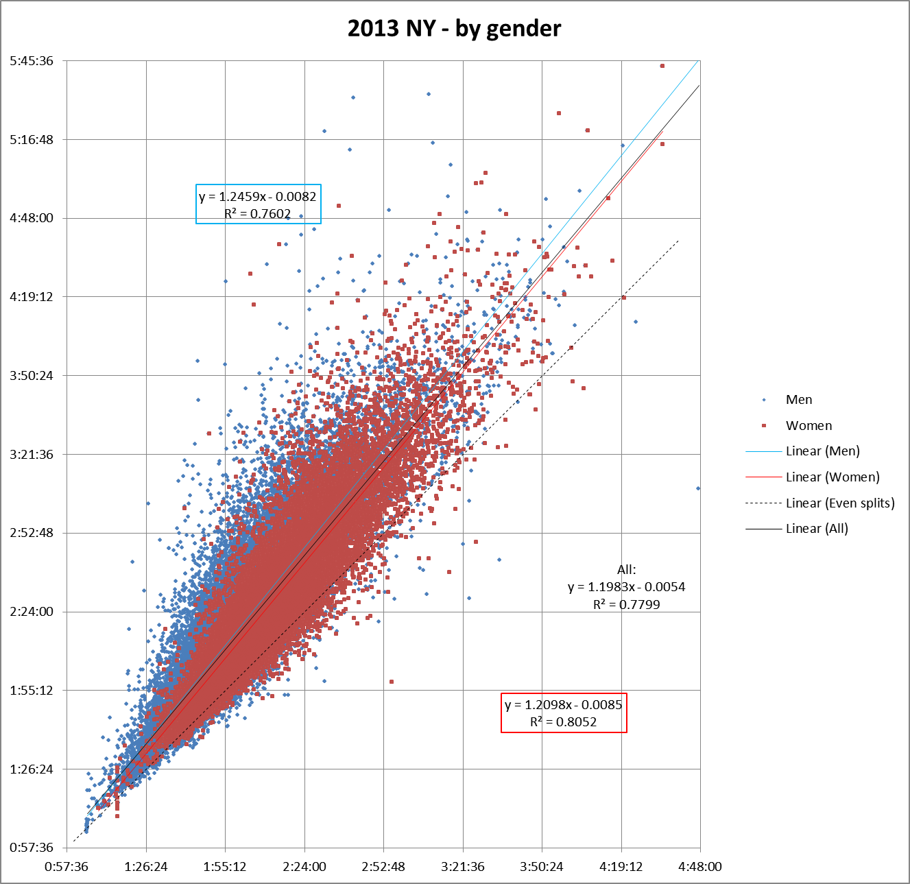
Assuming that most runners are trying for even splits, what this probably does show is that men are more likely to go out too fast and fade in the second half (Congratulations, ladies!).
Let’s look at some other races to see if the trend is consistent.
To compare Boston data with another large race, last time we used Chicago 2013. Unfortunately, I don’t have gender data for that race. Luckily, I just got the data from the 2013 New York Marathon (thank you, NYRR!). They included information about each runner’s gender:
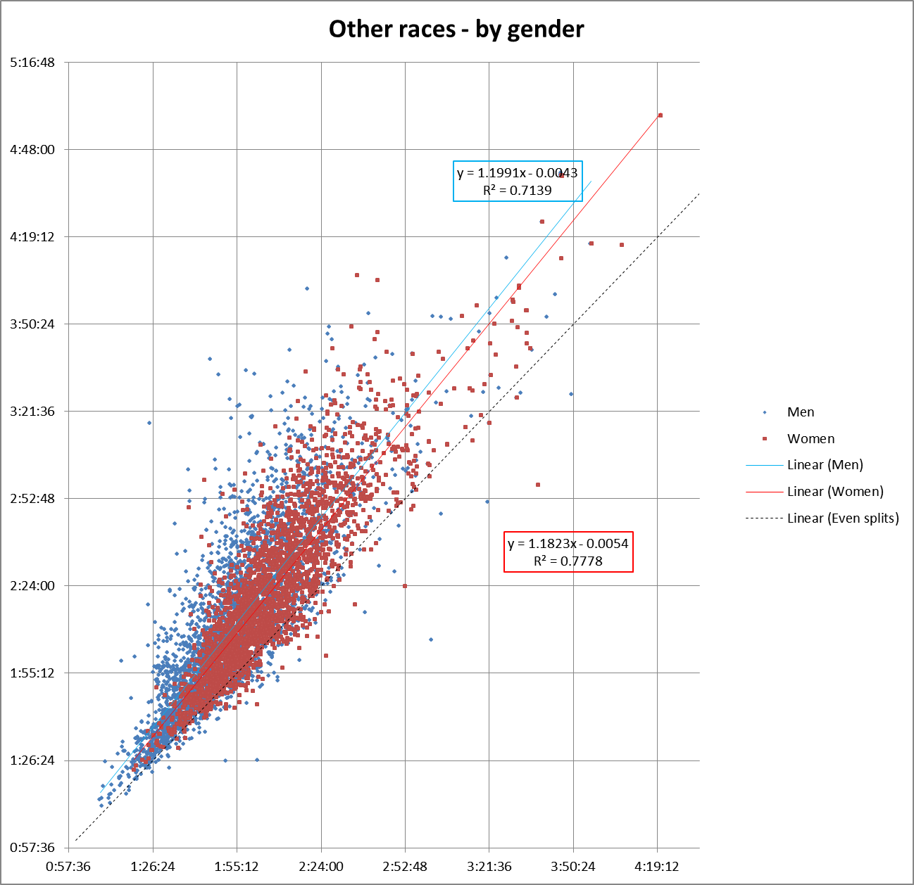
And here’s the data from the five smaller races that we looked at earlier:
Congratulations again, ladies.
Coming up next, we’ll start to look at race fields sliced up by time.


