(This is the 7th post in a series that started here)
We’ve been using linear regression to analyze and compare races, partly because it can be a useful summary of the entire field, and partly because Excel makes it easy to do.
What happens if we try to use linear regression to look at smaller groups of runners within a race?
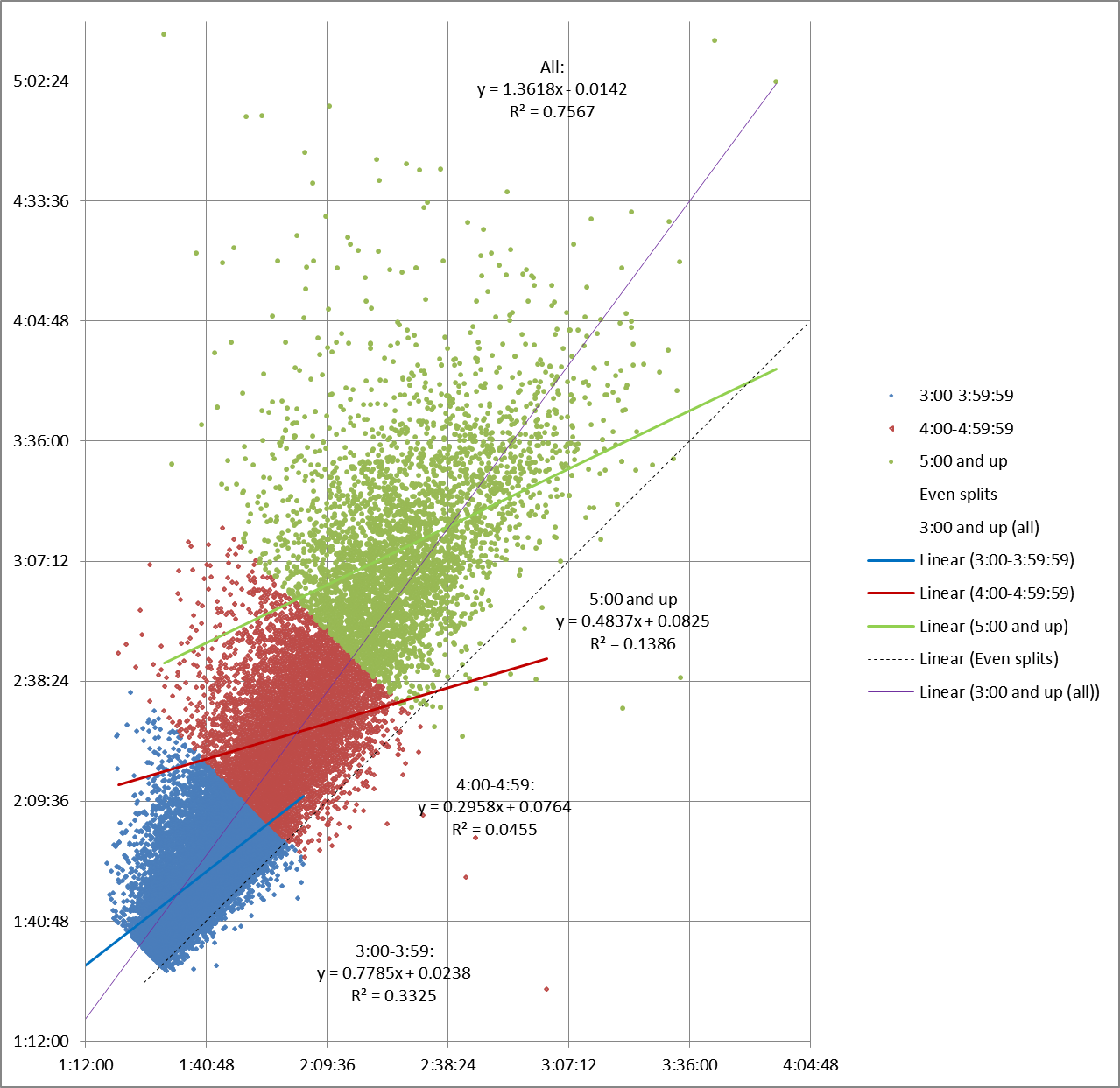
Here’s what happens if we split up the Boston 2014 field by finish time:
The main thing we can see is that R2 plummets. It’s almost .8 for the entire data set, but .33 or less for the smaller chunks, getting very near zero for one group. In other words, when we look at linear regression for an hour’s worth of finishers at a time, an individual runner’s first half split is almost useless when trying to predict their second half split.
That’s consistent with what we learned from the 2013 results – linear regression isn’t very useful when applied to partial race fields.
Instead, let’s take a look at the “moving average” for our data set. A moving average is a set of numbers, each of which is the average of the corresponding subset of a larger data set. It’s a simple way of smoothing out the data without forcing it into a straight line.
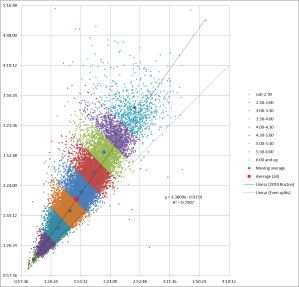
To get the moving average, I divided the field up by finish time into half-hour groups, then plotted the average first half split versus the average second half splits for each smaller group of runners. Unfortunately, that’s more difficult to tease out of Excel than a linear regression, but after fiddling around for a while I ended up with this:
The overall average for the entire data set is shown by the red square. Note in passing how it falls right on the linear regression trendline.
The average for each half-hour chunk is represented by a blue diamond. Connect them up, and the resulting moving average line still follows the linear regression, but instead of forming a completely straight line, it makes a curve with a ‘S’ shape that swerves back and forth slightly relative to the linear regression.
What this shows us is that while the overall trend for all pairs of splits is positive, the trend for the runners at either end of the data set is less positive (closer to even splits) than it is for the runners in the middle.
This makes sense if you think about it.
Even (or negative) splits are the goal of most runners. We expect the runners on the fast end of the distribution to be able to do a better job of holding their pace and achieving that goal.
 On the other hand, the slowest runners’ splits curve back toward the even split line because they have fewer illusions. From the start, their goals are less about speed and more about surviving the 26.2 mile distance. So, as the saying goes, they “start out slow, then back off”, which makes them less likely to crash-and-burn.
Meanwhile, the middle of the pack (my people!) has more runners failing to hold on (on average) because they push the pace more than the slower group but lack the ability (on that day, at least) of the faster group.
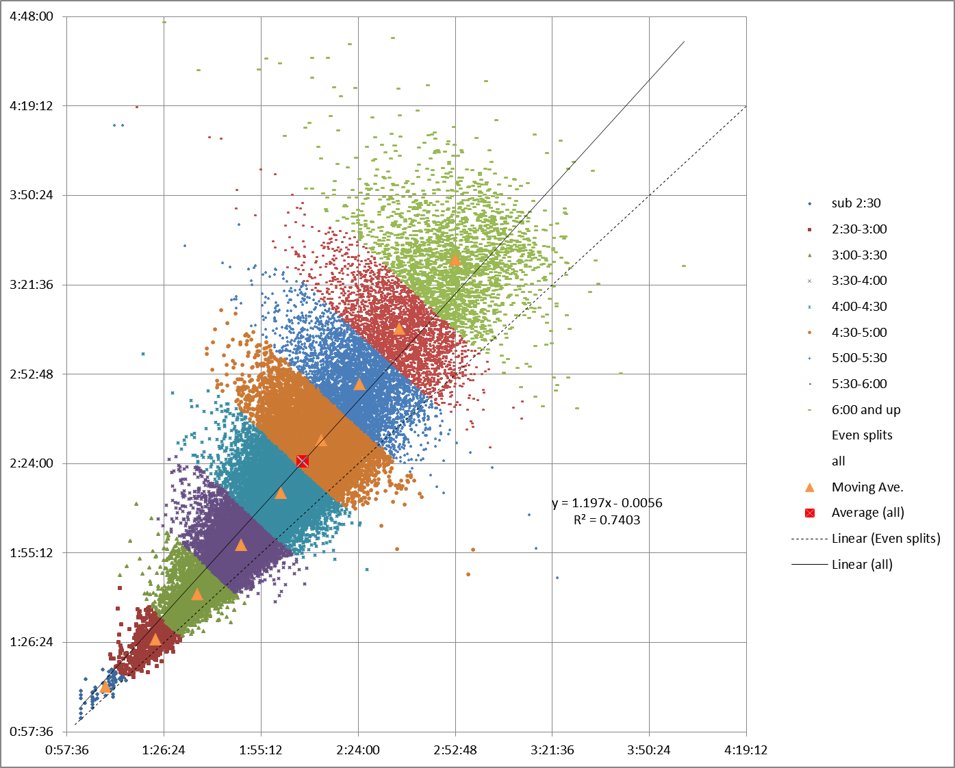
You can see results consistent with that theory in the moving average chart for Chicago 2013:
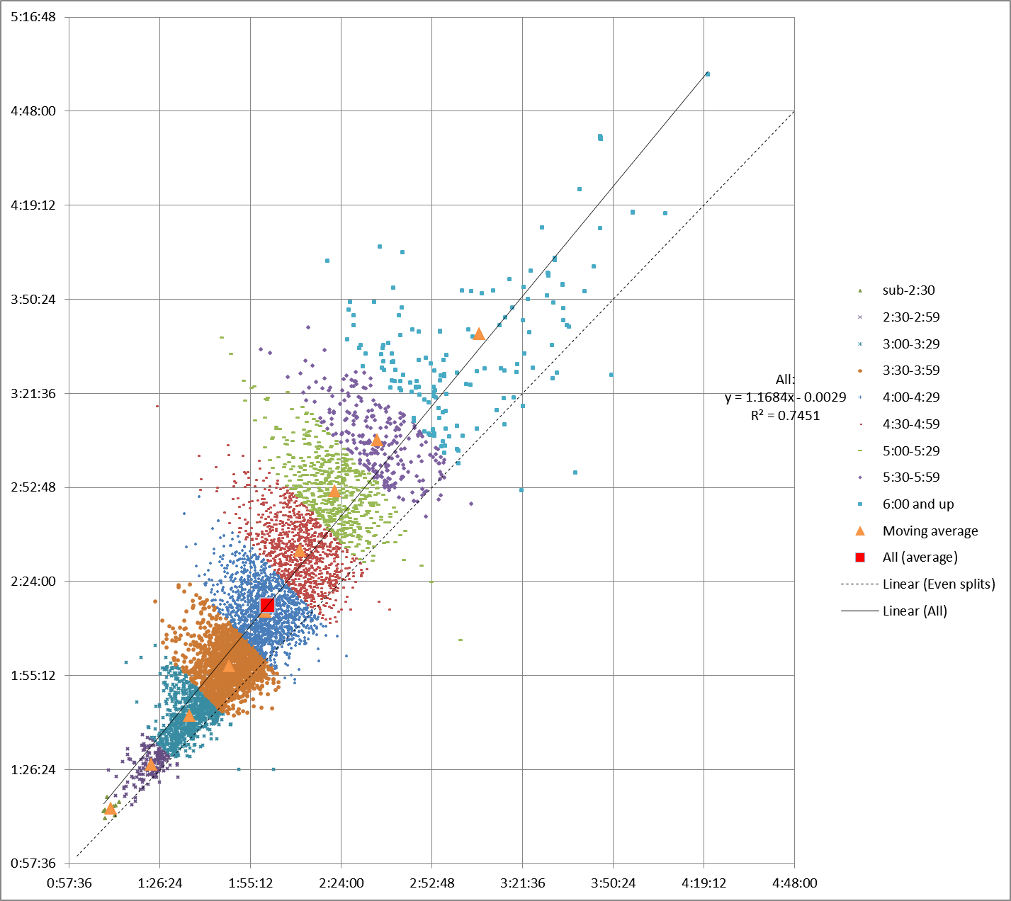
And for our set of five smaller races:
Is the moving average a better representation of the data? Depends on what you need to do.
If you’re looking at runners within a single race, the moving average can tell you more than a straight line about how those runners are distributed without overwhelming you with data points, like the scattergram can.
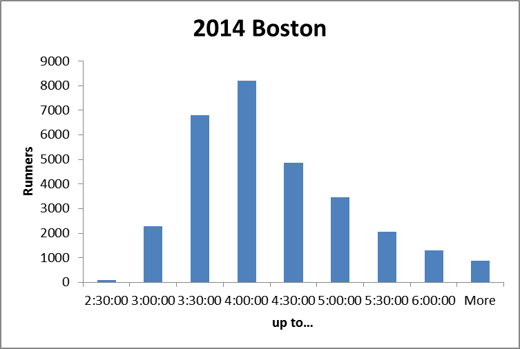
But it ignores the “weight” of each group. As this histogram shows:
there are many more runners in the mid-pack groups than in either the fastest or slowest groups.
The linear regression takes the relative size of each group into consideration. And the resulting straight line is handier for comparing split trends between races.
I’ll take a closer look at one of the groups of runners in my next post.
(Note: I’m figuring this all out as I go along. Comments or questions, especially from people who’ve taken more stats classes, are always welcome!)

I think your conclusion from the first graph may be flawed. What you’re saying is that if I know a runner finished between 4 and 5 hours, and I know his first half split, that information is nearly useless for predicting his second half split. I find that very difficult to believe.
By creating the subsets the way you have, I think you’re skewing the results. If you only look at the 3:00 to 4:00 subset, for example, 100% of runners with a 2:00 first half will run a negative split for the second half. But if you look at the 4:00 to 5:00 subset, 100% of runners with a 2:00 first half will run a positive split. Neither is a valid conclusion.
How about creating subsets based on first half split time, instead of total finishing time? That should work.
Thanks for your comment, but you might want to revisit your thoughts. The subsets are created from the actual results without any skewing.
Consider your first example. Suppose the 4-5 hour runner runs a 2:15 first half. His second half could be anywhere from 1:45 to 2:45 and still fit in the 4-5 hour group. What I’m saying is that the data doesn’t do much to narrow down a second half split prediction any farther.
In your second example, it is perfectly valid to say that all runners in the 3-4 hour group with a 2 hour first half have run negative splits. So? That doesn’t mean that all 2 hour first halves end up in the 3-4 hour group. Given the overall trend towards positive splits, there are probably many more 2 hour first halves that end up in the 4-5 hour group. The vertical line that represents a 2 hour first half crosses through sub-4’s, 4-5 hours, and even slower finish times.
By the same reasoning, I think the conclusions from the second graph (moving average) are also suspect.
If you divide up the data by first half splits, the resulting trendlines are too steep rather than too shallow, but still less useful than both the regression across the entire data set or the moving average.
But there’s another way, addresses both of our issues, perhaps.
Pingback: This is the chart traders are fixated on right now – CNBC | I am John Becker