(This is the 11th post in a series that started here)
Last time, we defined a “split score” as a runner’s raw split divided by their finish time.
Split scores work great for individual runners, easily showing us that a 5-hour marathoner’s 10 minute split is smaller, relatively, than the same raw split would be for a 3-hour runner.
That’s all well and good, but split scores will only matter to anyone if we can use them to gain new insights about runners – in general, or when we group them by time, age, gender, or in other ways.
The core of any potential usefulness for split scores is their ability to make comparisons between runners of different abilities more meaningful – to say, “All else being equal, here’s how the 5 hour marathoners compare to the 3 hour marathoners.”
The math is easy, and the logic behind it makes superficial sense. What I’m not sure of is what, if anything we gain by doing this. Because the main difference between 5 hour and 3 hour marathoners IS their finish time.
Whatever. Get to the point, Charbonneau. Show us some split scores. Maybe we’ll see something.
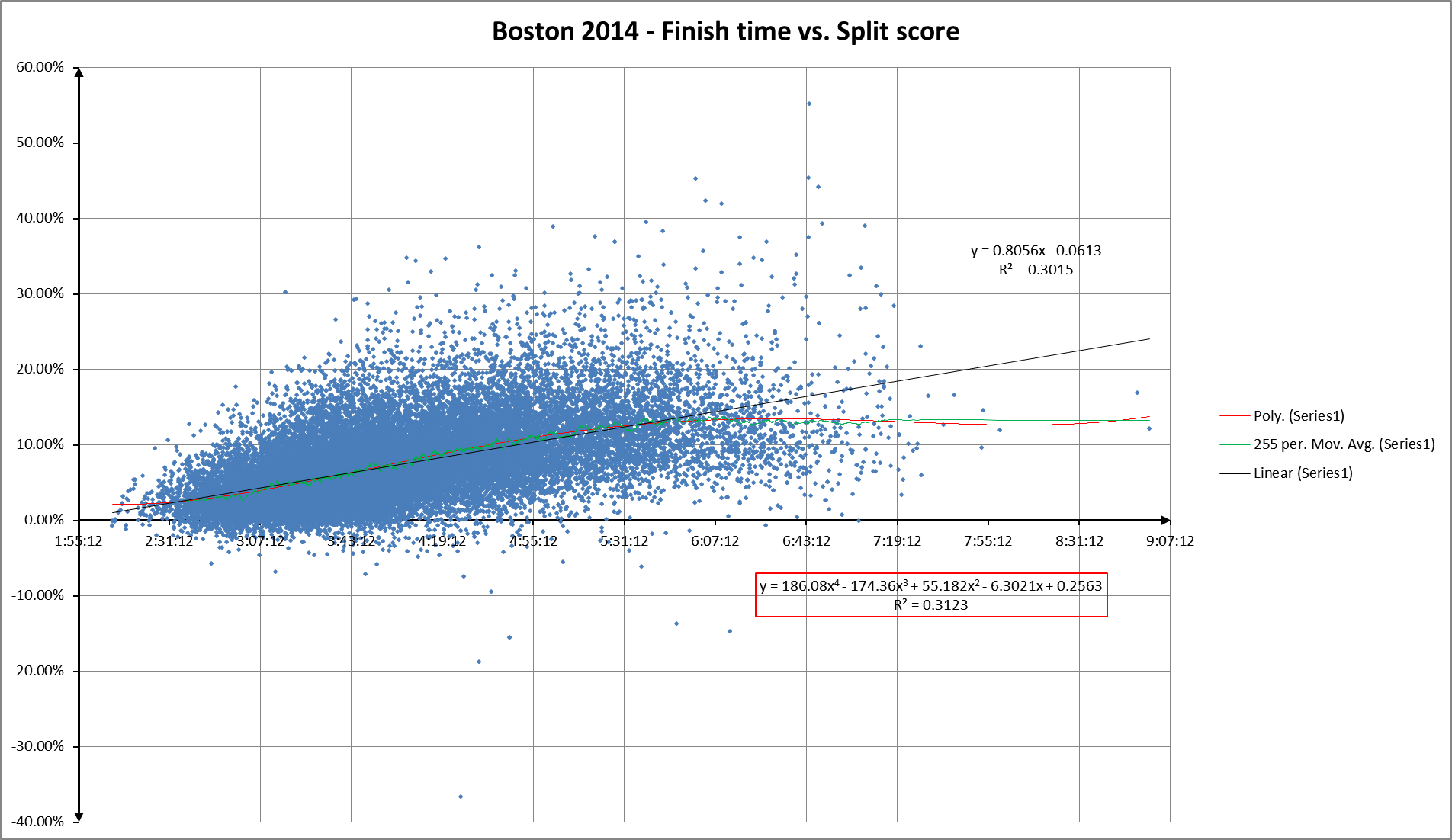
Here’s finish time vs. split score for Boston 2014:
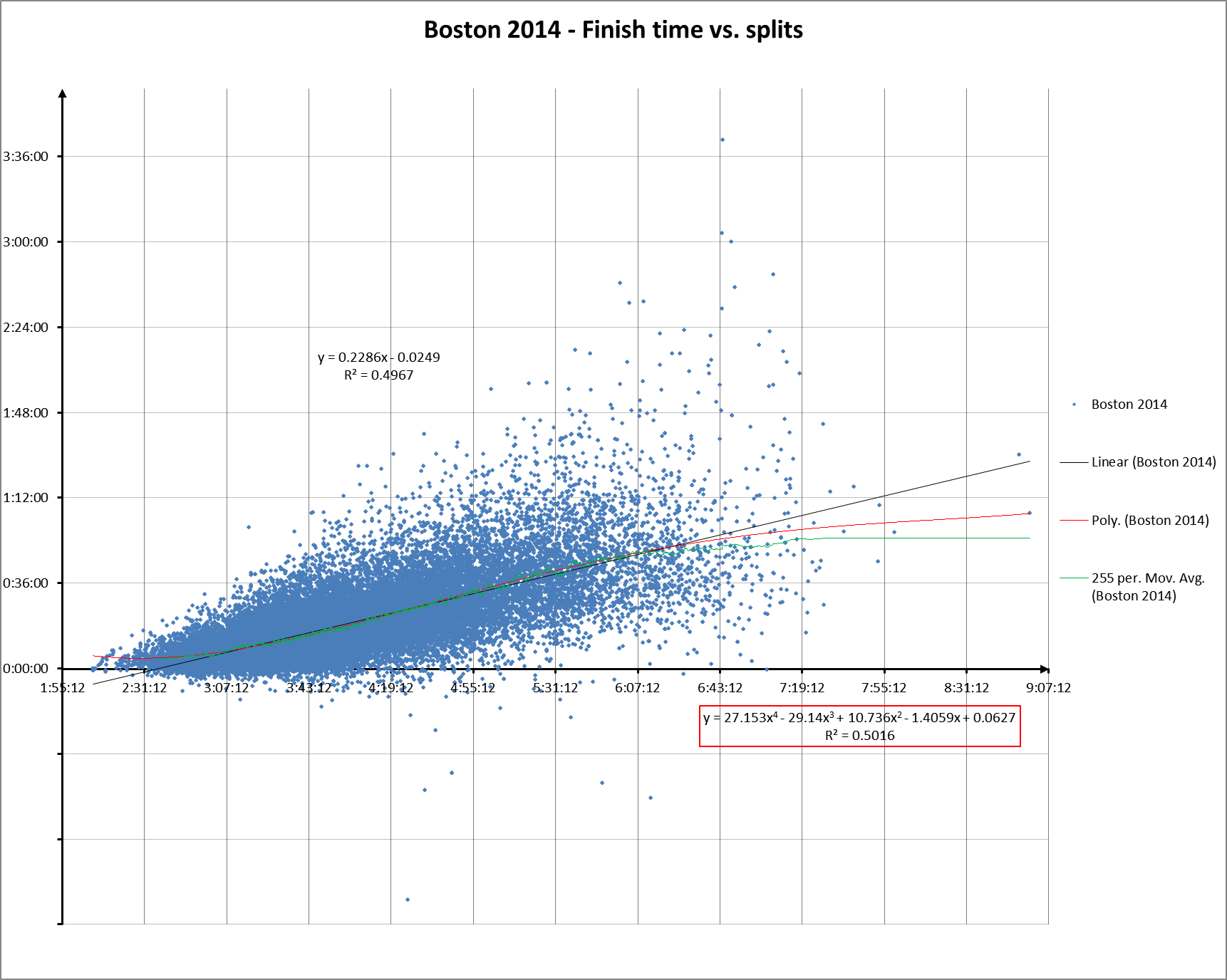
And to refresh your memory, here’s finish time vs. raw splits:
You can’t compare the two directly, but you can see how the general shape of the split score scattergram hews closer to the horizontal axis.
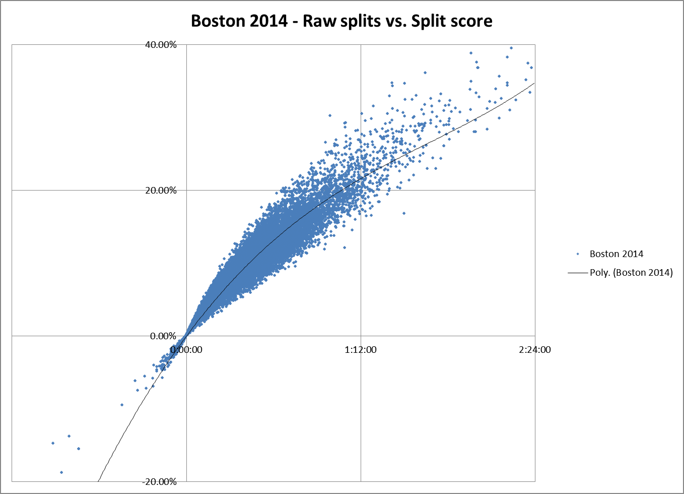
If you plot raw splits vs. split score, you can see that the relationship is non-linear:
As it should be, since another way of looking at split scores is that if you make a right triangle by plotting splits versus finish times, the split score is the tangent of the angle between the hypotenuse of that triangle and the side represented by the finish time.
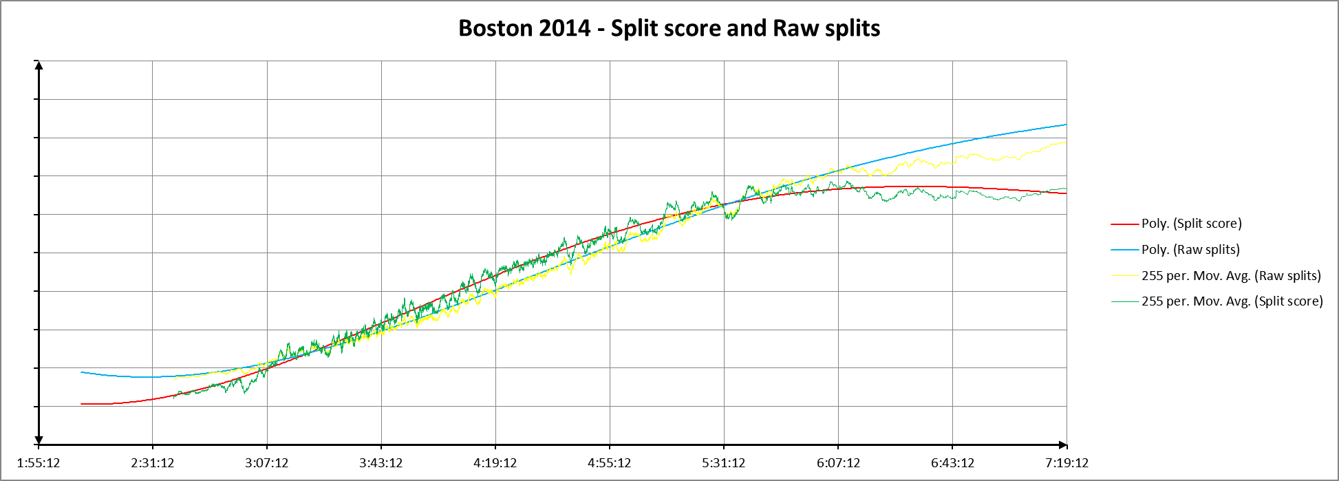
In spite of that, on the next chart, I plotted the moving averages and 4th order polynomials for the two data sets, scaling the raw split data so the linear regression for the two sets of data overlaid each other as much as possible. That choice is entirely arbitrary, and is probably more misleading than it is revealing since the relationship between the two data sets isn’t linear, but it does show something about how the two sets of curves change relative to one another:
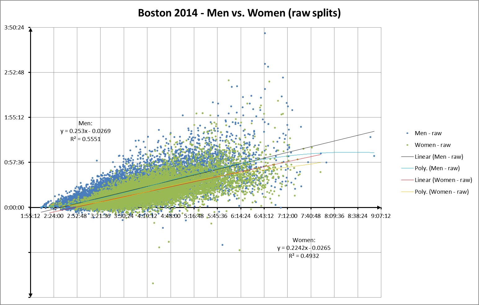
Let’s try comparing men vs. women. Here’s raw splits vs finish times, divided by gender:
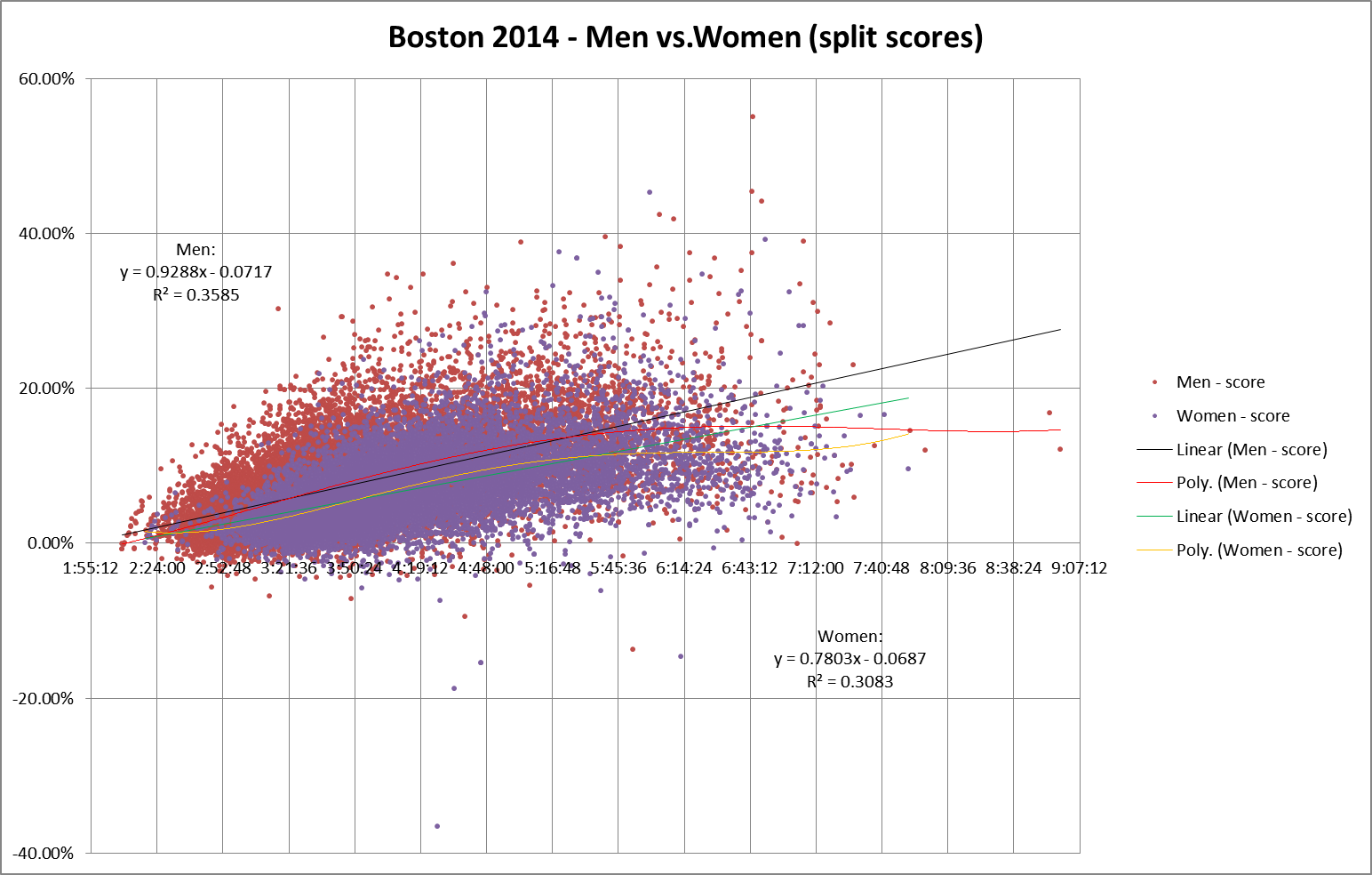
And here’s the same chart, with split scores replacing raw splits on the Y axis:
The use of split scores seems to accentuate the spread of values for any specific finishing time, which also increases the difference between men’s splits and women’s splits. Perhaps because split scores remove another source of autocorrelation error by factoring out finish time?
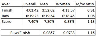
This chart tries to summarize the differences:
Men have faster average finish times, but larger average splits, whether you measure raw splits or split scores. The difference is slightly greater for split scores. Note that the average split divided by the average finish time is not the same as the average split score.
There’s certainly a difference between raw splits and split scores. Does that difference help us find any better answers for our questions? What do you think? I still don’t know, but I did find one use for split scores in my next post.

Pingback: Do Women Marathoners Push Themselves As Hard As Men? | Y42K?